




A stock chart is like a graphical picture of a stock’s price movement over time. Learning how to read stock charts is one of those first skills every investor and trader really needs to build early, even if it feels a bit messy at the start. Stock charts combine price data with trading volume and also technical indicators into one single visual thing.
You’ll see tools like line charts, candlestick charts, and bar charts that show the market trends in a clearer way. This guide explains each part of a stock chart so you can study its performance and make informed decisions with confidence.
What Is a Stock Chart?
A stock chart is basically a visual tool that shows a stock’s price over time. It helps investors spot trends, identify reversals, and find trading opportunities quickly and easily. Most stock charts have a kind of familiar frame; on the x-axis you’ll usually see time (minutes, days, months, or years), and on the y-axis the stock’s price. Many charts then add extra layers too, like trading volume, moving averages, and other technical indicators, so you get a clearer idea of what’s pushing the price around.
Why Reading Stock Charts Matters
- Spot trends early; charts help you see if a stock is moving up or down or staying flat sideways. Meanwhile, you watch it; it’s pretty useful, really.
- For time entries and exits, look for these visual patterns so you can spot where to buy or sell in a way that makes sense.
- You can gauge market sentiment by observing how volume and candle shapes behave, which will give you a sense of whether buyers are more confident or if sellers are leaning the other way. It’s a bit like reading mood through motion.
- Manage risk by using support and resistance levels on the chart to help you decide on stop-loss levels and take profit targets.
Key Elements of a Stock Chart
Every stock chart is built from a handful of core elements. The table below summarizes what each one tells you.
| Element | What It Shows | Why It Matters |
| X-axis (Time) | The trading period—minutes, days, weeks, or years | Sets the timeframe for your analysis (short-term vs. long-term) |
| Y-axis (Price) | The stock’s price level | Shows how far and how fast the price has moved |
| Price plot | Line, candlesticks, or bars | Visualizes open, high, low, and close prices |
| Volume | Number of shares traded | Confirms the strength behind a price move |
| Indicators | Moving averages, RSI, MACD, etc. | Adds context on momentum and trend strength |
Types of Stock Charts
Line charts, candlestick charts, and bar charts are basically three key tools for stock market analysis. Each one shows the same underlying price information but with a different vibe, and when you look at them together, you get a wider, almost full picture of what’s happening in the market and where it seems to be heading.
1. Line Chart
The most straightforward way to show a stock’s price over time is a line chart. It connects each period’s closing price to the next with a single line, giving a clean, uninterrupted view of the overall trend. That makes it really handy if you want to catch long-run patterns and the kinds of market jitters that show up as time goes on.
To create a simple line chart, plot each period’s closing price on the y-axis and time on the x-axis, then connect those points with a single line.

2. Candlestick Chart
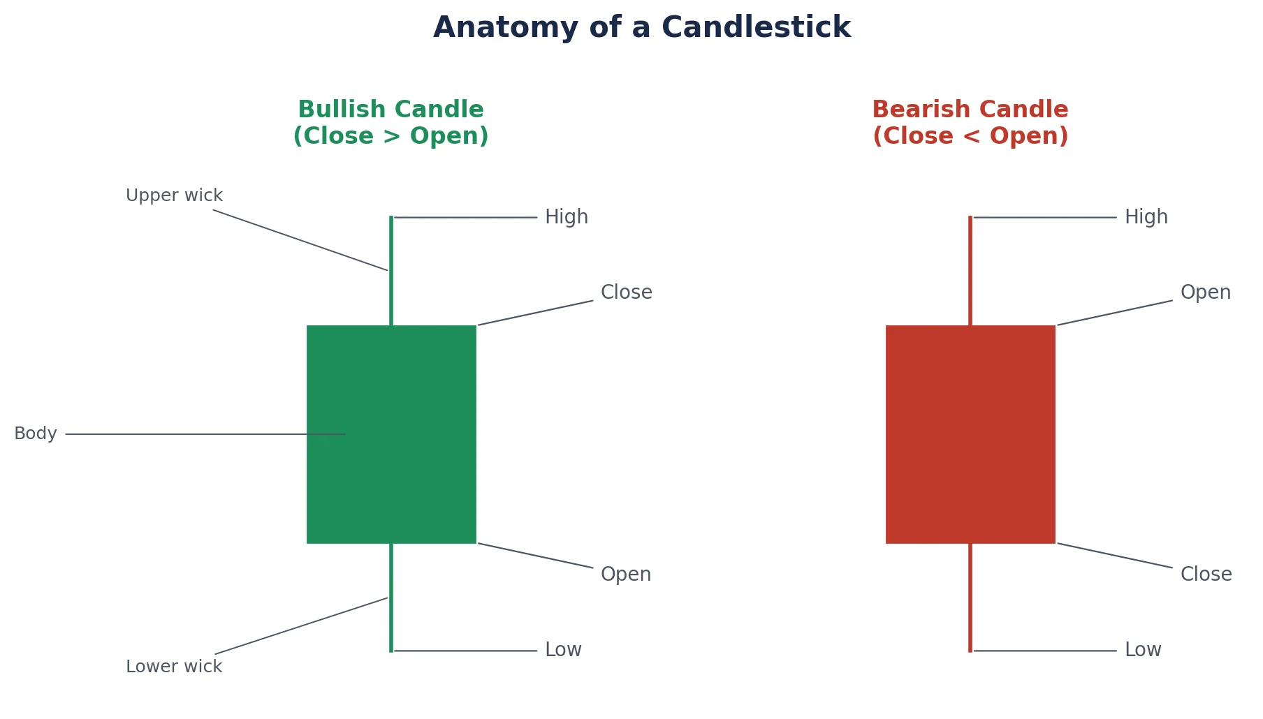
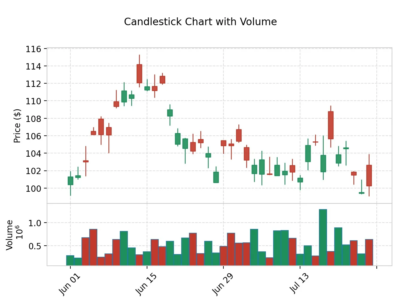
Candlestick charts are the preferred tool for in-depth, detailed research. Each candlestick represents a certain time frame, say a day, an hour, or even a week. It shows 4 data points at once: open, close, high, and low. Since they “picture” the tug-of-war between buyers and sellers, candlestick patterns are extra popular with traders who are trying to guess near-term market moves.
Now, every candlestick has two main parts, and it sounds simple, but it helps a lot. There’s a rectangular body, and then there are two thin wicks (also called shadows) on the sides. The body shows the price band between the open and the close. The wicks, meanwhile, mark the highest and lowest prices that the market actually reached during that period. A green, or hollow, body usually indicates that the stock closed at a higher price than its opening price. A red, or filled, body means it ended lower.
3. Bar Chart (OHLC)
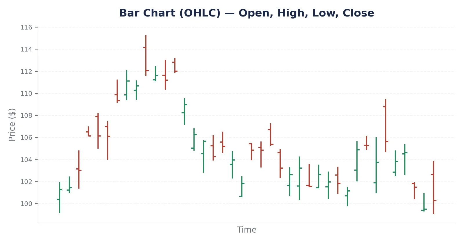
Like candlestick charts, bar charts show the same open-high-low-close information, but in a slightly different way. In a typical bar chart, each bar is basically a vertical line that indicates the price range during a set period, and then you see these small horizontal marks, which show where the market opened and where it finally closed.
For an OHLC bar, the very top of that vertical line stands for the high, and the bottom part marks the low. The tiny horizontal tick on the left is the opening price, and the tick on the right is the closing price.
Line vs. Candlestick vs. Bar Chart: A Quick Comparison
| Chart Type | Data Shown | Best For | Limitation |
| Line Chart | Closing price only | Spotting the long-term trend at a glance | Hides intraday volatility (high/low/open) |
| Candlestick Chart | Open, high, low, close | Short-term trading and pattern recognition | Can look cluttered over very long periods |
| Bar Chart (OHLC) | Open, high, low, close | Traders who prefer a minimalist visual style | Harder to read patterns at a glance than candlesticks |
Understanding Trading Volume
What Is Volume?
Volume is like the number of shares of a stock that get exchanged during a specific period. It’s a critical part of the puzzle when you’re reading stock charts because it shows the “strength” behind a price move. For example, a large price swing with high volume is much more significant than the same kind of move on thin trading, so it gives you a clearer picture of what’s really going on, even if the chart line looks similar.
Where Is Volume Plotted?
Volume is pretty much always plotted like bars or a histogram under the main price chart, like in Figure 3 above. With this setup, traders can quickly check how strong the market bustle is in a given time window without really having to leave the main chart at all.
What Volume Tells You
| Signal | What It Usually Means |
| Rising price + rising volume | Strong, healthy uptrend with broad buyer participation |
| Rising price + falling volume | The uptrend may be losing momentum or conviction. |
| Falling price + rising volume | Strong selling pressure; potential trend reversal lower |
| Sudden volume spike | Often signals news, earnings, or a shift in investor interest |
| Low, steady volume | Low conviction; price moves may be less reliable |
Common Stock Chart Patterns to Know
Once you’re comfortable reading the basic chart types, the next step is recognizing recurring price patterns. These patterns don’t really guarantee future performance, but they can help frame probabilities, like you know, in a more grounded way.
| Pattern | Type | What It May Signal |
| Head and Shoulders | Reversal | A potential shift from an uptrend to a downtrend |
| Double Top / Double Bottom | Reversal | Price struggling to break a level twice, hinting at a reversal |
| Cup and Handle | Continuation | A pause before the prior uptrend potentially resumes |
| Ascending / Descending Triangle | Continuation | Consolidation before a breakout in the direction of the trend |
| Flag or Pennant | Continuation | A brief pause after a sharp move, often followed by more of the same |
Step-by-Step: How to Read a Stock Chart
- Pick your timeframe, I mean sort of, and then decide if you’re looking at long-term shifts like weekly or monthly charts, or if you want the quick stuff, like daily and intraday moves.
- Try to spot the trend. Just look at the overall trend; for example, if the stock is making higher highs and higher lows, that indicates an uptrend. Alternatively, is the stock making lower highs and lower lows, which would indicate a downtrend? If the stock appears stuck and moves within a narrow range at the same level, it is essentially moving sideways.
- Just read the price action, then switch it over to a candlestick or bar chart. That way you can actually see the open, high, low, and close for each period, all laid out. Don’t overthink it too much, though; it helps a lot.
- Check the volume real quick, confirm if those recent price moves are really backed by strong or maybe weak trading volume, and do it like you mean it; don’t half it.
- Try to search for patterns and indicators, like scanning for recognizable chart patterns, and then bring overlay tools in as extra confirmation, such as moving averages. Don’t just stare at one line; watch what repeats and use these extra checks so you don’t miss the obvious.
- Set your levels—use visible zones of support and resistance to plan your entries, exits, and stop loss level in a practical way.
Common Mistakes to Avoid
- Ignoring volume and just going by price alone, like that, is kind of misleading sometimes.
- You end up reading too much into one candlestick, without the surrounding context, which is honestly the part most people skip.
- For example, a day trader who relies solely on monthly charts is not using the appropriate timeframe for their trading strategy.
- Treating chart patterns as guarantees is misleading; they are more accurately described as probabilities or mild odds, rather than certainties.
Quick Tip
Try to blend chart reading with the fundamentals as well. A stock chart shows how the market behaved, but when you add company fundamentals, you get a fuller picture of the why, not just the what.
Final Thoughts
Getting comfortable with how to read stock charts is essential if you’re planning to step into stock trading and investing. If you can recognize line charts, candlestick charts, and bar charts—as well as when you pair them with volume analysis and those usual chart patterns—you’ll likely be in a much better position to decide what to do, even when the market is acting a bit volatile.
FAQ
Why do traders prefer candlestick charts?
Candlestick charts kind of pack more information—open, high, low, and close—into one simple visual, so recognizable patterns are easier to spot, and that’s why short-term traders tend to favor them.
Does high trading volume always mean a stock will keep moving?
Not always. A big volume indicates strong involvement in the current push, but it still doesn't definitively determine the direction. This indicator can be useful but only if you use it in conjunction with other cues. Otherwise, you might miss important context.
Can stock chart patterns predict the future with certainty?
No, chart patterns do indicate historical behavior and probabilities, but they are never a guaranty. They tend to work better as just one input, among several other things, in a wider, more balanced analysis.
How much history should I look at on a stock chart?
It kind of depends on your goals, you see. Long-term investors usually stare at months or even years of data, while active traders tend to zoom in on days or sometimes minutes.